Forsaken Stars Issue Five, Page 1
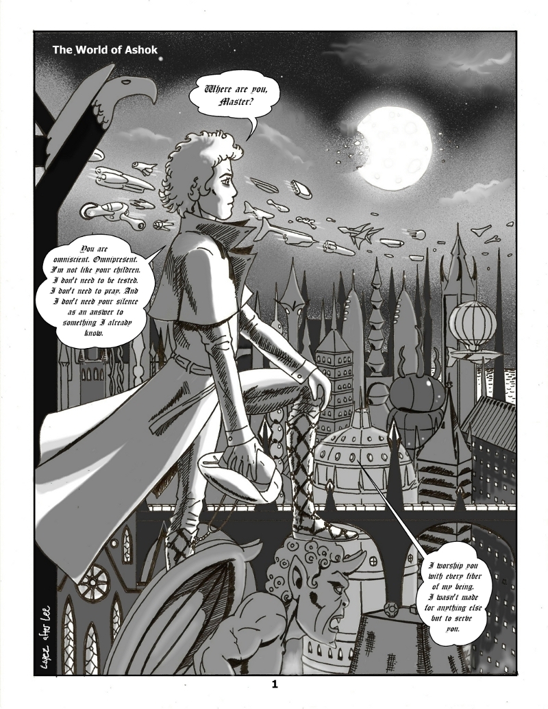
We’re off on another adventure, with a splash page that tips its hat to Jim Lee’s powerful renderings of Batman and Superman and Wim Wenders’ Angelic Masterpiece Wings of Desire (1987). Fabius, an angel, looks over a gothic port city on the world of Ashok, and wonders why he cannot hear, feel or otherwise sense his master, the creator, God.
Although I don’t want every character to have a unique font, I thought I’d try out Cloister Black for Fabius. Thoughts? Hard to read or understand? Let me know!
CTRL + will zoom the comic and CTRL – will shrink the comic.


I have a little bit of trouble reading it, but you know I’m half blind anyway. Otherwise it’s a beautiful page. I love the moon, and how he’s standing on the gargoyle in a way that makes it look like he’s actually indifferent to the ugliness of it and the satanic/classic demononic way it looks.
Yeah, I may ditch the Cloister Black old English font, as lovely as it looks. Maybe I’ll check Blambot for a similar, more readable font…
Font a little difficult to read but oh my God! The overall effect is beautiful!
A great page, the sky (be interested to know how you achieved the effect), the buildings, the figure. All beautiful. Yes the text is hard to read without my glasses, but the art can’t be faulted.
Thank you, Rita, that means a lot!
I will likely go to a more legible font, but I had to try this one out, it just looks sooo heavy and full of the weight of ages. But maybe just the usual font in all caps might do the trick.
Started in ol’ Corel Painter, mostly using a coarse digital airbrush within the masked area of the sky, in a combination of black and a couple varying grays to get the stars and ‘city haze.’ Then I used the eraser tool (I use it a lot) on the moon, with about a 20-30% opacity and sized a bit bigger than the moon itself to give it the appearance of glowing.
Then after I painted the rest of the scene with digital watercolor washes (grays and blacks again), I moved into GIMP 2.6 for a few final touches like the clouds, which I made by dropping some white paint into the gray spots and using the smudge tool to make them look wispy.
Added the word balloons and caption in Manga Studio Debut and voila! Sounds easy, but since I’m not a PROfessional, it takes awhile for me to figure out by trial and error which tools will be best to achieve the desired effects/the look I want.